The time goes nowhere and the year is already half over!
Blogging is a lot harder than it seems. As a reader, it is easy to miss the fact, that someone is spending their time, sometimes lots of it, trying to write about things that they find interesting.
Comic strips and comic books, which can be read quite quickly, sometimes, fool the reader into believing, that the creation of that content, was also speedily achieved.
Nothing comes without a price and our time is the currency we spend, in making or doing anything.
Wimbledon, is a movie that I literally stumbled across, never having heard about it's release. It was in the theatres in 2004 but I didn't see it until 2015 and it is a great little film. I watched it again last night!
As a group, I would place Wimbledon, with A Good Year, Shirley Valentine and An Ideal Husband, which is pretty high praise indeed.
On the comic book collecting front, their really isn't a lot being published, that catches my imagination, these days and most of my purchases are of books and magazines that are related to the field of cartooning.
Illustrators Quarterly 14, just arrived at the Silver Snail this past week and despite it's truly steep cover price, $30 Cdn, I bought it. I have a complete set, so far and it is a very classy product, well produced and beautifully printed. It also manages to shine a spotlight on European artists, being British it's self, that are often under represented in North American publications like Illustration Magazine.
Speaking of publications from the Illustrated Press, I managed to find a copy of their third volume of The Golden Age, at The Beguiling and bought it, along with
Kelly Green: The Complete Collection.
Classic Comics Press has done an excellent job of scanning and enhancing the art, from all five of the original books, so that this volume has the look and feel of an "Artist's Edition".
It isn't cheap, at $70 Cdn, but it is well worth the money to a fan-boy geek like me!
Warren Kremer, is not a name that too many comic book collectors would recognize but he was a giant within the comic book industry. Warren Kremer worked for Harvey comics for 34 years and he either created or defined the look of their most well known characters.
A consumate comic book artist, his pages are beautifully designed and drawn and remind me, in a way, of the work of Joe Kubert, who's work is also a text book to making comic books.
The pages above, are from the amazing western story "Tex", written by the Italian storyteller Claudio Nizzi.
They should have subtitled it, Comics 101because it is a masterclass in how to design and draw readable comic books.
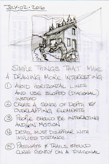
One of my intentions, at the beginning of my Blogging, was to share some of my thoughts and ideas about how to make comic book art appealing and readable. It is something that I have drifted away from but I would like to return to.
Here is a minor list of guidelines, that I cobbled together the other night and I thought, as basic as it is, some struggling amateur cartoonists, might gain an insight from it.
Happy Cartooning Folks!


